Hi, I’m Jeremy
about me
I’m a game designer and developer from the San Francisco Bay Area now living in Seattle. I design and build systems and mechanics for my own games using the Unity engine and programming languages such as C#.
I enjoy games from many genres, from open-world exploration to fighting games to RPGs. Despite their differences, I’m fascinated with the design space they share: a character’s running animation, the feeling of navigating menus, how it sounds to pick up an item. To me, the heartbeat of a fun game is conveying information in a way that is both obvious and unobtrusive, a contradiction that I think is the most important challenge of game design.
Because conveyance is such a large part of my design ethos, I want to create holistic experiences that take advantage of gaming as a multimedia art form. With a background in music and visual media, I understand the variety of ways in which a game can help its player intuit the fun of the experience.

(i’m the one in the jacket)


My other projects have been more realized explorations of simpler game systems.
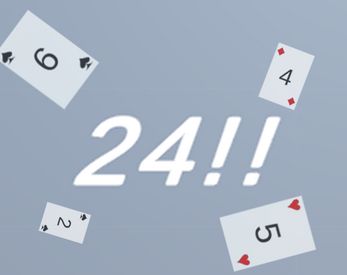
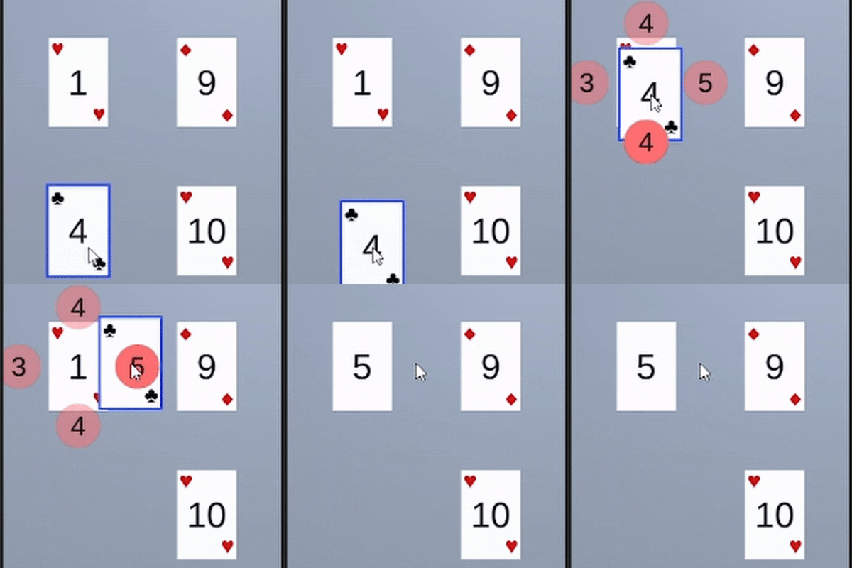
My adaptation of the card game 24 aims to match the feeling of the physical game with I played with my family— fast and fluid. Digital playing card games like Solitaire tend to work great with drag-and-drop systems, but the branching interactions between cards made implementing such simple controls a challenge. The version I came up with minimizes the time between seeing the puzzle’s solution and executing it, which adds a lot to the speed of the game compared to other versions. In particular, I spent a lot of time considering how to maximize the information conveyed by a single mouse stroke.
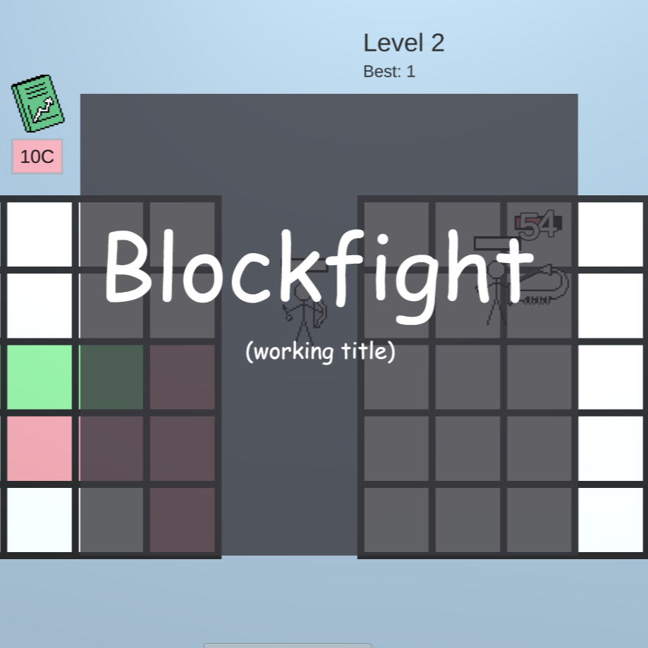
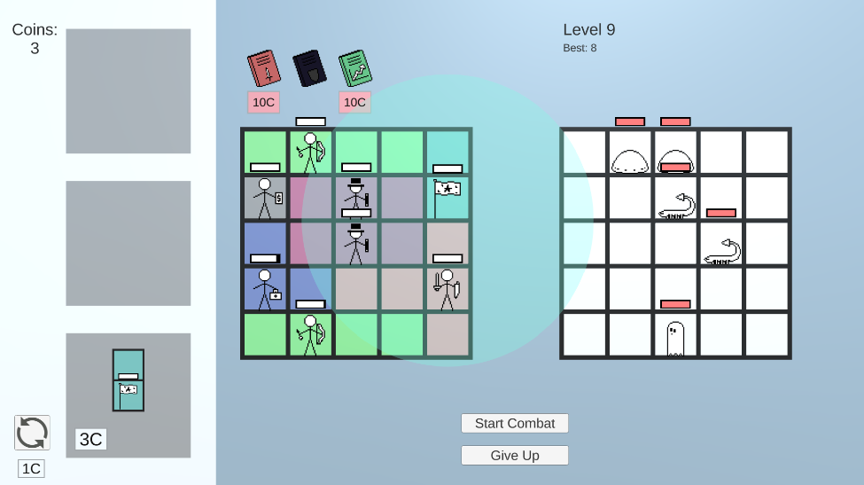
Blockfight (working title) is a roguelike puzzle autobattler in which a square puzzle board challenges the player to maximize their army in a limited space. The pieces available to use are randomly selected, which leads to each game being different than the last, so I had to carefully balance each character to create many viable strategies. In particular, some shapes take up more space or are awkward to fit next to other shapes, and carefully counterbalancing those attributes with higher stats was an important design challenge. I consider fine-tuning of parameters like this among the designer’s most important work because it’s not only integral to a fun and intuitive system, but also rewards people who engage deeply with games and their “meta” strategies, like me,
Portfolio
what I do
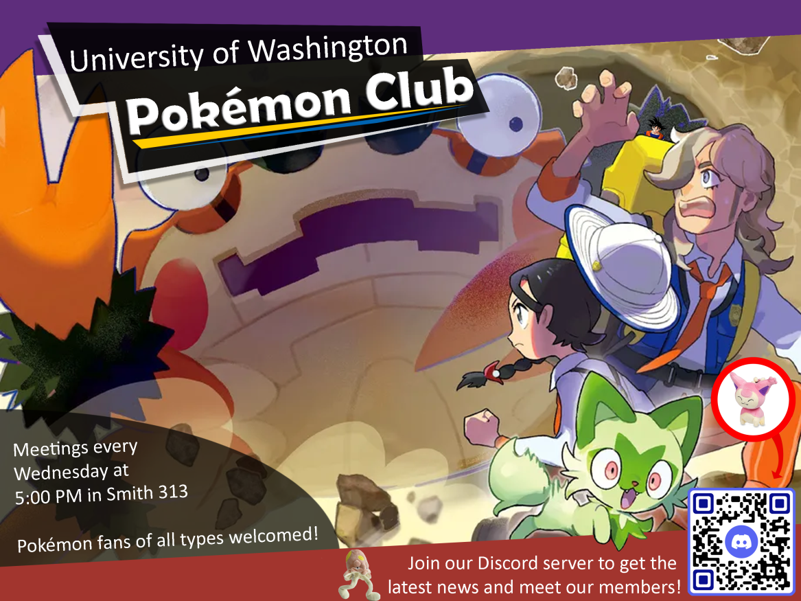


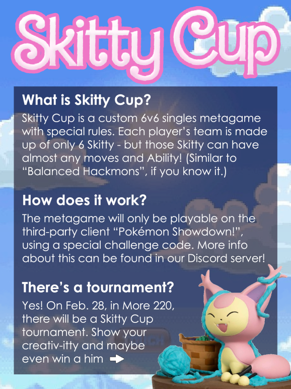

I’ve always pursued an interest in graphic design using raster editors like Photoshop. Shown here is some of my work for the Pokémon Club at the University of Washington. Whether in print or on social media, these promotional materials are aligned closely with my preference to prioritize readability, writing important information clearly in both language and font. My experience with different mediums also affects my approach to functional design; a poster meant for printer paper might have white borders to account for the margin some printers leave, where a digital-only poster has eye-catching information centered to display even when cropped.
More coming soon!
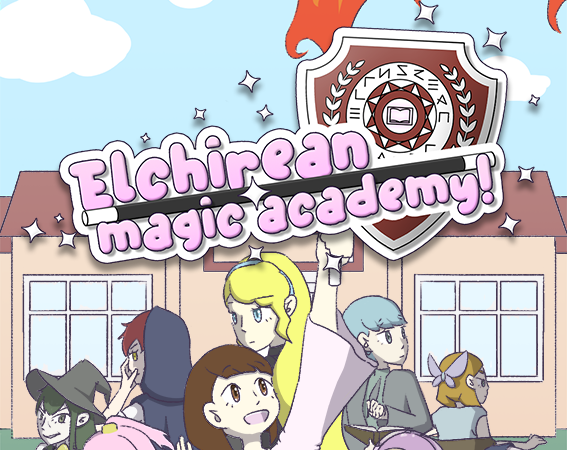
Elchirean Magic Academy! is a turn-based strategy game and time management social sim, and my largest project to date. It’s inspired heavily by the Persona and Fire Emblem series, which represent two of my favorite genres, with a further emphasis on being approachable for people with all levels of gaming experience. From the simple controls to the bright and cheery world, everything about EMA! is designed around its core goal of being a comfy starting point into sometimes-daunting genres. I make everything in the game, from its music to its animations, letting me precisely control the overall experience they create. In particular, I’ve spent a lot of time on character gameplay and balance, level design, and progression mechanics.
It’s still a work in progress (probably about 50% done) but it teaches me more about game design every day!
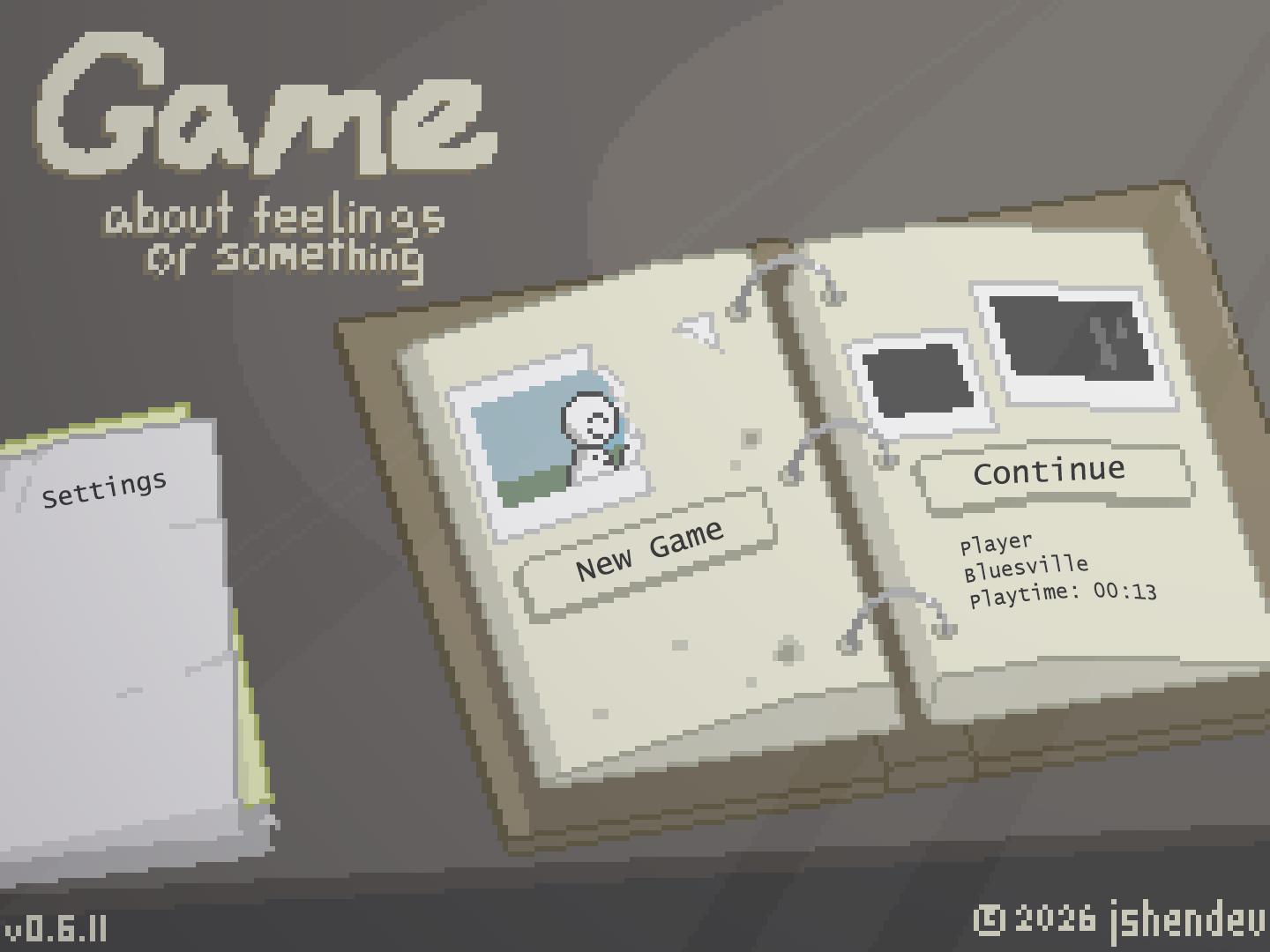
This was my submission to the Main Menu Jam!, for which the prompt was to create a mock main menu conveying a specific emotion. I’m practiced with pixel art, a medium evocative of bygone decades, so I chose to theme my submission around nostalgia. This decision comes through in the worn color palette and vintage-feeling 4:3 aspect ratio. But the project as a whole ended up taking on a feeling I struggle to put concisely: viewing an unpleasant past with rose-colored glasses. Finally, the title of the “game” is a purposefully silly touch that adds a hint of needed levity.
This was a great exercise for me because a good title screen is an important, if underutilized, first impression for a game to make. Almost all video games convey a majority of their information through visuals, and the title screen is the best opportunity to prepare the player for that aspect of the experience.